10 easy ways to make any PowerPoint presentation awesome
This post was updated in 2023.
It was 20 minutes before lunch, my client was frantically looking at the clock, and the audience was squirming. We had suffered through endless forgettable PowerPoint slides and were all hoping for a merciful end. That's when the presenter announced, "I see I'm running out of time, so I'll just hurry through my last 30 slides."
We’ve all suffered through slide shows with long lists of unreadable bullets, unnecessary YouTube clips, and overuse of graphics. Instead of holding our attention and making their point even stronger, each slide distracts the audience with more content they don't need. Bad slides are agnostic. You can use PowerPoint, Keynote, Prezi, Google Slides, or hold up a piece of paper - it's all a distraction if you don't do it well.
Done well, a thoughtfully prepared slide deck can be the perfect slide dish for your full meal presentation. Done poorly and your audience will feel like they made one too many trips to the buffet table. This post will help you do it well.
For the first years of my speaking career, I presented with 35mm slides. You know, the photographs framed by cardboard that got jammed in the projector? That was me - hauling out the projector, clicking in the carousel, and praying that tonight it would all work. I soon learned that the more slides I showed the less the audience listened to me. So I cut back on the slides. I also noticed that when I switched to a black screen (see #9) the audience turned all their attention to me. So I practiced fading to black whenever I told a story or had an important point to make.
How I started
When I switched to PowerPoint I suddenly had a candy shop full of treats to sweeten my presentations with. And I started making all the same mistakes again: too many slides, too much content on each slide, and too distracting. After every presentation I always do a quick debrief - what worked, what needs to change? And slowly I developed a checklist for slide presentations.
I have shared with checklist with hundreds of speakers to help put the spotlight on them. Some were designing a new speech, some were preparing for a webinar and others needed slides to back up a video presentation. In every case, this checklist made their presentation better. They sold more products, got more referrals, and, in most cases, spent a lot less time working on their slide deck.

If you’ve ever struggled to create interesting slides or worry your slides are too wordy or you have too many of them, this will help.
Here are my 10 easy ways to make any PowerPoint presentation awesome.
1. Build your slides last
This might be the most important rule on the list. Don't build your slide deck until you build your presentation.
You could be tempted to start monkeying with slides early in your speech writing process - after all, it's a fun way to procrastinate from all that hard thinking - don’t. Building your slide deck before you build your presentation is like building a road before you know where it's going.
Your slides are there to ADD to a well-designed speech, not to replace it.
2. Don't try to replace you
People come to hear you. If you are launching your service on a webinar, they want to know how this solution has helped you and whether is it right for them. If you are delivering a keynote speech or workshop, they want a glimpse into your solutions that can help move them forward in their work or in life.
Fancy transitions, superfluous video clips, and endless bullet points will get your audience's attention, but take their attention off of you. Every time you hit the clicker the audience leaves you and goes to the screen.
Your goal for every presentation is to deliver the goods, not the slides.
3. Use a consistent theme
We are easily distracted and confused. That's why brands always anchor advertising on their unique colors, fonts, slogan, or a jingle. They know that consistency in their brand theme builds recognition and puts more attention on the message. You should do that with your slides.
Start with a simple, white background and san serif fonts.
A consistent, simple theme helps your audience focus on the content of each slide. Watch TED talks that have gone viral to see how simple a slide theme can be, like the ones by Dan Pink The puzzle of motivation (30M views), and Shawn Achor The happy secret to better work (25M views).
4. More images, less text
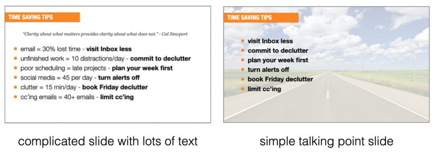
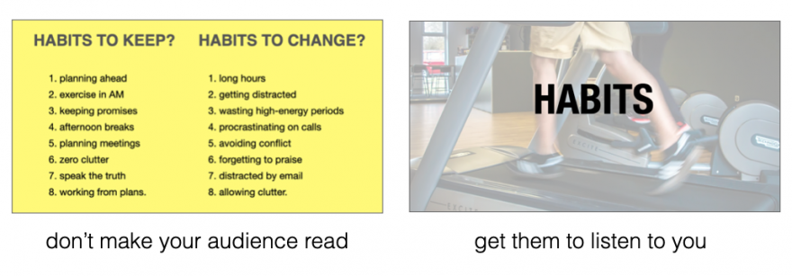
Want to quickly reenergize a tired slide deck? Make your images larger (in this post I share where to get free images) and reduce the text size. Remember, the theme in this post is that you are the presentation, not your slides.

Your brain can process images 60,000 times faster than text. When you use images (and less text) you allow your audience to process the image without distracting them away from your powerful story, or making a critical point. Like subtle mood music in the background of a dramatic movie scene, images can augment and enhance what you are saying without stealing the show.
5. One story per slide
When I started using PowerPoint I would have 60 to 80 slides for a 60-minute speech. It was a lot of work to prepare each deck and when I was deep into the speech I would sometimes forget where I was and have to jump forward a couple of slides.
Then it became 30-35 slides and I could breathe easier, knowing that fewer clicks meant less to worry about. As my confidence grew it became 10-12 slides and each slide became a key part of storytelling or point-making—they had to earn their place.
I might use a slide as a backdrop to a story or for a short list that supports a lesson I'm delivering. Either way, it's always on 'story' per slide. If I don't need a slide, I fade to black (#9).
But, I always stick to one story per slide.
6. Reveal one bullet at a time
This is an easy one - reveal one bullet at a time. The function of bullets is to reinforce (not replace) what you are delivering. That's why they need to be short (see the 2/4/8 rule, below). A good bullet point is complete on it's own, but much better when combined with a live presentation of it. Here's an example from a list of (very wordy) time management strategies:
Infrequent visits to your Inbox give you more time for deep work
time blocking allows you to protect time for important work
the Pomodoro technique can help you focus with fewer distractions
A better list - like one you might use on a PowerPoint slide - would be:
visit your Inbox less often
block time for important work
the Pomodoro technique helps you focus
To reveal one bullet at a time in PowerPoint, right-click on your text box, select Custom Animation > Add Entrance Effect and then choose the effect you want. In Keynote, click Animate > Build in and choose the effect you want.
7. Leave the fireworks to Disney
It’s great that you know how to turn text into flames and make images spin with the click of your mouse - but leave those fireworks to Disney. Your job is to make your content the star of the show. Every time you haul the audience's attention away to some animation you lose a truckload of opportunity to help them.

Your slides can still be amazing and helpful, but that should always be secondary to your primary purpose of helping people. Simple transitions, clean, san serif fonts, and large, attractive graphics trump PowerPoint tricks, every time.
8. The 2/4/8 rule
When I am advising other speakers I often don't know their topic—certainly not as well as they do. So I rely on certain rules I have developed over many years. For slide decks, I use my 2/4/8 rule. Here's how it goes...
about every 2 minutes I have a new slide (that's 30 slides for a 60-minute speech),
no more than 4 bullets per slide, and
no more than 8 words per bullet.
Just like any recipe, you can mess with the ingredient a bit. If your content is more technical, you might need more slides. Sometimes I need 5 or 6 bullets. I use the 2/4/8 rule to remind me that slides are there to support what I have to say, not replace me.
9. Fade to black
The last time I was shopping for a car, I noticed the salesperson had a clever technique. While he asked how I liked the car and if I had any questions, he kept his sales offer face-down on the table. Because there were no other distractions, he had my full attention. And when it was time to reveal his offer, it was much more dramatic (so was the price!) Use the same technique with your slides.
When you fade to black you regain your audience’s attention. For example, after I present a solution, I’ll fade to black while I expound on how to apply that solution in my audience's work/life. When I'm finished, I turn black off and go to the next point. Or if I'm halfway through a story I'll fade to back before the punchline so I know I have everyone's attention.
It’s no different than a close-up scene in a movie—the director wants you to focus only on the speaker. Note that if you are shopping for a slide remote, be sure that yours has the black screen feature.
10. When in doubt, delete
This might be the most advice I can leave you with. When in doubt, delete it.
There is a weird attraction to more. Authors add more pages thinking it makes the book more valuable. Sales people who talk too much miss the opportunity to ask for the sale. And presenters add more slides thinking it will make them look better. Wrong.
When you are doing the final edits on your slide deck, the ultimate question you should be asking about each slide is,“Will it make my speech better?” If not, dump it.
Remember, nobody will miss what isn’t there. Also fewer slides allows you more time for side stories, spontaneous thoughts or even time for Q&A.
Remember this...
I've said it numerous times in this post, but it's worth repeating. You are the show, not your slides. More slides means more time your audience is not paying attention to you. Fewer (and better) slides means you have more time to build rapport, share memorable stories, explain your solutions and motivate your audience to action. You are there for a reason. Now go and deliver.
One last thing. Spend the $80 and pack a remote (with spare batteries.) Nothing’s worse than watching a speaker repeatedly lean over, hunt for the right key, and then peck away to advance the slides.
If you enjoyed this article, here is more about presentation skills:
How the experts create world-class PowerPoint Slides (and you can too)
PowerPoint Primer – the only 3 slides you’ll ever need
How to add video to PowerPoint and Keynote like a pro
Slide by Nathan Anderson on Unsplash
Small Wins - Why Little Steps are the Path to Big Rewards
Keynotes and workshops by Hugh Culver


